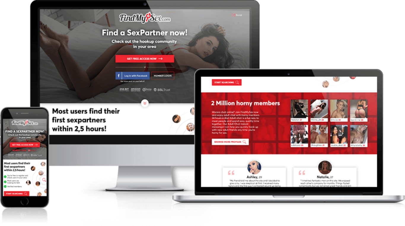
Deciding on a website design and layout could be the single most important decision you make for your new online presence. We could go on for hours about designing a successful website, and we will expand on this knowledge in our articles section. For now. lets touch on some important things to keep in mind:
Presentation
Typically, all adult websites have the same look and feel. It is certainly ok to think outside of the box and design a website that will be pleasing to the eyes and create a comfortable user experience. You’ll want to choose a layout that supports your niche, with colors to support it. These principles hold true, regardless of whether you’re designing it yourself, paying someone to do it, using a template, or using a turnkey solution from a content provider.
Layout
When someone visits your website, they will read your page in an F shaped pattern. This is why you will see navigation on the left and/or the top of many websites. You’ll want to add links to free galleries, promotions, free trials, etc in this area, with the meat of your content in the middle. A great guide, is look at other sites for inspiration.
Color
Something that is overlooked a lot is what color theme your website will have. If you’re making a website called collegecoedshomealone.com, then you would want to use common sense and choose colors that evoke the images of college girls. Blush pinks, baby blues, plaids are all colors that come to mind. If you’re making a site of British sailors, then what comes to mind? Usually its red, blue, black, and white. You wouldn’t, for example, have a babysitter website with the colors of neon green and orange. Once again, if you have any doubts, just look at other sites for inspiration.
Samples
This one is easy. If you have done the chore of securing fantastic content, then give your visitors a taste. Give them something that will wet their appetite for more. This is where you’ll be able to get some good conversions by showing visitors a sample of what they can see in the site. We all know, that the cover on the porn is seldom what is on the actual DVD itself, so show them some sample images or video clips. One other thing I would suggest is to use images from the content you’re providing. Nothing can be more frustrating than coming to a website, seeing a beautiful girl (or guy), scrambling to put put in your credit card number, only to be disappointed by not being able to find any of the content that was hinted at on
Content
We’re not referring to the pictures and videos here. We’re referring to the written content on the page. You will want something there so that you can do search engine optimization and get your website out there. 2-3 paragraphs on your main page, with keywords of your niche thrown in. Don’t just feed the content with these keywords. Do use these keywords in coherent sentences that explain what you offer, how often your updates are, etc. This is your chance to sell your site to the customer, don’t lose the opportunity. If your site offers 3 updates a week, then please, tell them that. If your site offers access to 4 other sites when they sign up, then let them know that as well.

